| |
| |


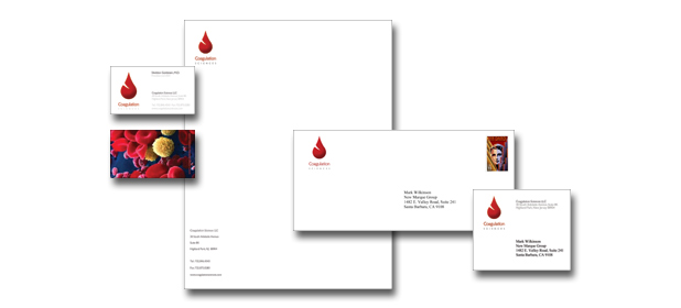
 Coagulation
Sciences LLC is a blood testing innovator that helps blood banks
and hospitals to significantly decrease blood transfusions. Coagulation
Sciences LLC is a blood testing innovator that helps blood banks
and hospitals to significantly decrease blood transfusions.
In creating their corporate identity package we explored several
blood related themes including the concept of circulation as
a symbolic metaphor.
Ultimately, a stylized blood drop design was selected as the
company's symbol. The symbol is combined with a logo font that
is "vein like" in its tubular design. The symbol is
used as components for the stationery system illustrated above.
The back of the business card has an electron microscope image
of red blood cells and platelets to aid in communicating the
scientific research aspect of the company's products.
 Alternatively,
the components are integrated where appropriate. The combined
logo/symbol can be seen in the company's PowerPoint presentation. Alternatively,
the components are integrated where appropriate. The combined
logo/symbol can be seen in the company's PowerPoint presentation. |
|
|
|